Responsive Web Design Company in Chennai
Help visitors read your services, navigate your pages and send an enquiry on phones, tablets and desktops. Start with the mobile tasks your customers need to complete.
Responsive Web Design for Chennai Businesses
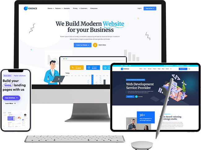
Choose responsive design when your current site is difficult to use on a phone or when a new website needs layouts for several screen sizes. Share the pages and tasks that cause problems, such as a crowded menu, small form fields or a table that does not fit.
This Chennai service focuses on mobile usability and the scope of a responsive rebuild. A new website, content rewrite or ongoing SEO programme is included only when it is part of the agreed proposal.
Identify priority customer journeys and the devices to check.
Review desktop and mobile layouts for the agreed page templates.
Build flexible layouts with readable content and usable controls.
Test navigation, forms and content on the agreed devices.
Record launch checks and any remaining maintenance responsibilities.

Why Chennai Businesses Choose Us
Remove Obstacles in the Mobile Enquiry Journey
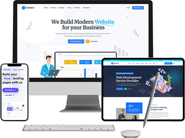
Responsive design adapts the layout to available space. Its practical purpose is to make the same information and actions usable on different screens.
Check whether a visitor can read the service details, open the menu and complete an enquiry without zooming or losing their place. Labels, validation messages and confirmation steps need attention as well as the form itself.
Use actual device checks and enquiry feedback to decide what to improve. A responsive layout alone does not establish accessibility, loading speed, search performance or a higher conversion rate.
Benefits of Responsive Web Design
Agree the checks for your main page templates, including menus, text, images, tables and forms. Test the same customer task at different widths; a page fitting on screen is only the first check.
- Mobile-Optimized Layouts
- Fast Loading Speed
- Scalable Images and Media
- Fluid Grid System
- Flexible Navigation Menus
- SEO-Friendly Coding
- Touch-Friendly Design
- Cross-Browser Compatibility

Prepare a Focused Responsive-Design Brief
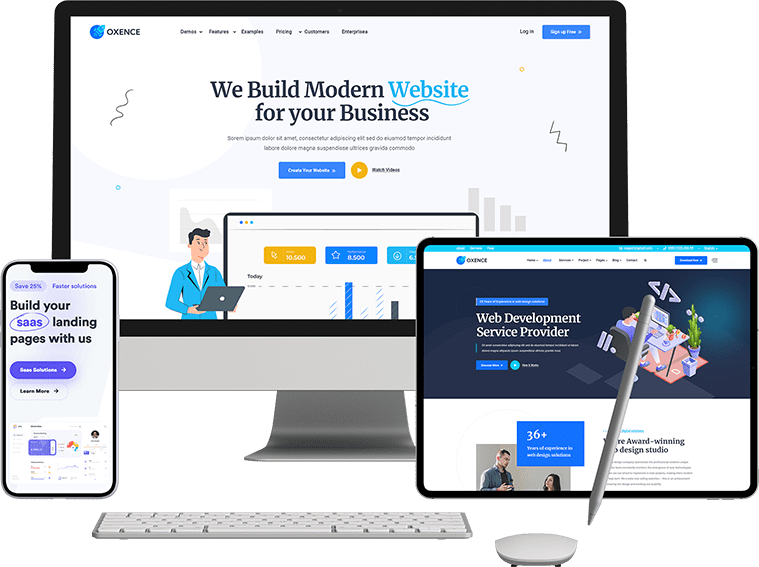
Send the current URL, the pages that matter most and examples of the difficulty on mobile. Agree which templates will change, which content will be retained and how the completed work will be reviewed.
Plan the Build and the Checks After Launch
Some sites need adjustments to a few layouts; others need a wider rebuild because the navigation or templates cannot support the required changes. Review the current site before choosing a package.
The quote should identify affected templates, browser and device checks, content migration and any ongoing support. Agree how old URLs will be handled if a rebuild changes the page structure.
Allow for new content
Test long headings, additional service text and different image sizes so routine content updates remain usable.
Maintain shared pages
Use one maintained set of content across devices, with layouts appropriate to the screen and the task.
Review enquiry quality
Compare completed enquiries and follow-up outcomes where tracking is available. Do not treat a visual improvement as a measured increase in sales.
Frequently Asked Questions
Straight answers on responsive web design pricing, timelines and results in Chennai.
Ready for a Website That Sells?
Tell us about your customers and goals — we'll recommend a scope, timeline and honest quote.